The Brand
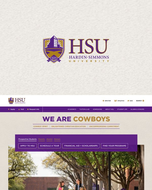
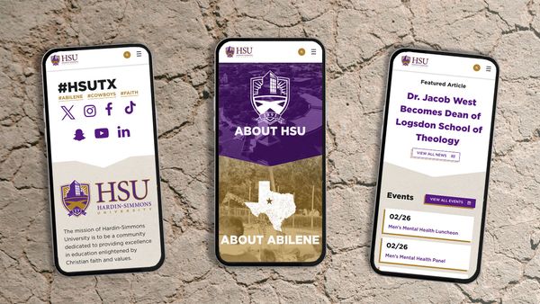
HSU developed a new guiding brand aesthetic that balanced their bold color palette with the two components of their identity: future-focused while confident in their western heritage. Resolving these two directions into one unified experience was the challenge, and our design team got to work.
User Goals
Along with effectively communicating their new brand, HSU wanted to streamline the content on the page and emphasize directions their four core user personas might be interested in taking. Finding a good way to do this above the fold was central to a definition of success.
Creating The Look
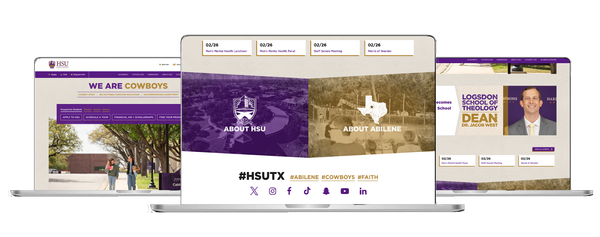
Clear on the goals of the project, our design team created three different looks for the HSU team to review. Each design took a different approach to providing paths above the fold for HSU's user personas, and each fell into a spectrum of western influence, sliding from subtle nods to confident western iconography and cowboy symbolisms. With this approach, our team could hone in on the exact balance of future-focus and western tradition the HSU team had in mind for their home page. After choosing a favorite and refining further with our design team, HSU was ready for our development team to make the design a reality.
Implementation
We created a staging environment to securely develop the new home page, meeting regularly with HSU's team in agile sprint reviews to make sure everyone was aware of the progress and able to provide feedback. After a handful of sprints, our collaborative work was ready to be shared with the world.


